Review: Laura Mercier Artist Palette for Eyes 2013
The first version of Laura Mercier’s Artist Palette came out last year, and I was just barely able to snag one – I actually would have missed out if a good friend from out of state hadn’t snapped one up for me. I wasn’t sure if I’d need this year’s Artist palette too, especially since four of the twelve colors are repeats. Ultimately I decided that if I missed it I’d probably regret it later, so I picked it up last week. After the popularity of last year’s palette, it’s no surprise that this year’s version flew off the shelves – the Sephora website sold out of it on the first day of the VIB sale. There’s no telling when/if it will come back in stock, but since it’s still available in some stores I wanted to get this review out ASAP in case you want to go grab it.
Packaging
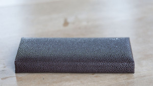
The palette comes as a slim little padded compact – at just 6.25″ x 3″ x .75″ it fits easily in the small Muji drawers or cramped travel bags. The outside is covered in a pebbled material that feels like vinyl or plastic, so it’ll be easy to wipe clean.
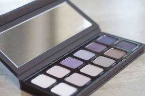 The insides of the palette are made of hard plastic. While that does add a bit of weight, the palette feels very sturdy. I’ve dropped my other one several times with no ill effects. The inside of the lid holds a large mirror – easily big enough to do your makeup with in a pinch – and the lid has a hidden magnetic clasp to keep it closed. One of the pans in my palette (Bamboo) is just tiiiiny bit off center, but they’re all glued in very securely. The palette doesn’t include any applicators, which gets a huge thumbs up from me – it keeps the palette as compact as possible, and it’s one less applicator for me to throw in a drawer never to be seen again. All of the pans are big, very easy to get your brush into. Each pan holds .03oz/1g of product – a third of the (huge) Laura Mercier single eyeshadows, but still a very decent amount.
Colors
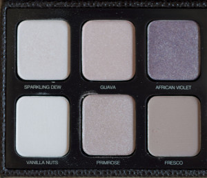
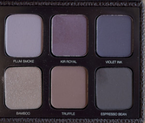
This year’s palette is arranged a little differently than last year’s. Instead of mattes vs shimmers, this one has cool colors on the top row and warm colors on the bottom row. None of the colors skew so far to cool or warm that they’re hard to wear though. Each row is arranged from the lightest to darkest colors. Laura must be in my brain, because I love how this is laid out – it’s the kind of palette that you can just put a look together with even if you’re on complete auto-pilot after a late night.
The one major concern I had about purchasing this palette was the fact that there are so many repeat colors. All of them are shades that I get a lot of use out of though; in fact, I’m about to hit pan on Vanilla Nuts. All in all I’ll probably use the repeats often enough that I’ll appreciate not having to get out the other palette. Just the same, I hope next year’s palette has more colors that weren’t included in the previous ones.
The palette is based strongly on pinks, neutrals and purples. There’s not quite as much variety as last year’s, but it would be hard to go wrong with pretty much any color combination. The colors included are:
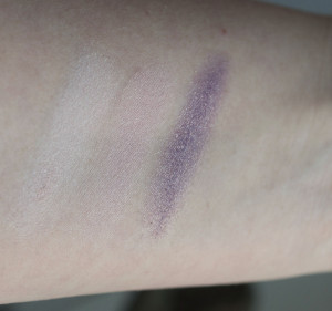
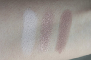
- Sparkling Dew – cool pinkish-white satin
- Guava (repeat) – peachy pink satin
- African Violet (repeat) – violet with gold shimmer
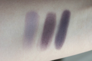
- Plum Smoke (repeat) – matte greyed plum
- Kir Royal – aubergine satin
- Violet Ink – deep matte plum
- Vanilla Nuts (repeat) – light matte cream
- Primrose – warm pink shimmer
- Fresco – matte pinky beige
- Bamboo – warm medium brown shimmer
- Truffle – warm deep chocolate matte
- Espresso Bean – very deep brown matte
Texture & Wear
All of the shadows are very pigmented, soft and apply smoothly and evenly. The mattes are a tiny bit drier than the shimmers, and can kick up a little bit of excess product if you dig your brush into the pan. I haven’t wear-tested every shadow yet, but the ones I have (Bamboo, Plum Smoke, Espresso Bean, Primrose, African Violet, Kir Royal, Sparkling Dew) wore well for 10+ hours (over primer), with no fading or creasing.
Comparison
I’m sure some of you are wondering how it compares to last year’s palette, so here ya go!
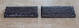
Both palettes are the same shape and size. The 2012 version had a snake-print covering, while this year’s has a pebbled texture. Last year’s was fabric vs vinyl, so it can get a bit dusty-looking if any powder products get onto it.
The colors in the 2012 version of the palette in my opinion weren’t quite as cohesive as this year’s, and the arrangement wasn’t nearly as straightforward. You could probably do more varied looks with last year’s but it would take a little more thought.
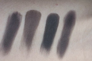
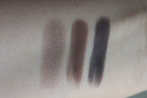
Left to right: Espresso Bean (2013), Coffee Ground (2012), Rich Coffee (2012), Espresso Bean again (2013)
I had originally planned to do full swatches of both palettes together, but then I realized that aside from the repeat colors, the only really comparable shades between the two are the dark neutrals. I swatched Coffee Ground and Rich Coffee against Espresso Bean for reference; I’d say Espresso Bean falls between the other two colors. If anyone is interested in full swatches of the 2012 palette please leave a comment and I’ll get right on that!
In Short: This palette has the same high quality and versatility that I’ve come to expect from Laura Mercier products, and I highly recommend it if you can grab one.
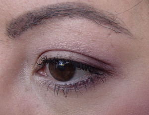
Primrose (lid), African Violet (crease), Kir Royal (outer corner/lower lash line), Sparkling Dew (inner corner/brow highlight) over Vanilla Nuts as a base.
The Laura Mercier Artist Palette for eyes is available at sephora.com and Sephora stores.


Joyce (bronzerbunny)
November 11, 2013 at 12:59 ami am skipping this because of all the pinky shades, plus i have the luxe color portfolio. But your swatches do make it very tempting haha!
niccigilland
November 11, 2013 at 8:27 amI’ve been so tempted by the luxe color portfolio! But I already have a couple of the things in it and I’m not sure the blushes would show up on me. Is the packaging on that one still slim enough to use for travel?
sandra
November 13, 2013 at 9:13 amGreat review and lovely look! Thank you! I am going to try to recreate it!
niccigilland
November 15, 2013 at 3:28 pmThanks! I’ll definitely be posting some more looks with the palette but winter + bad weather means terrible lighting for photos. Might have to set up a makeshift studio :-)